Typography
When used thoughtfully, typography becomes a powerful brand tool that can add visual meaning to our words. Our typography communicates clearly and cleanly, with enough flexibility for various situations.
Our communications use four very different typefaces that work together to bring our story to life. Each has strengths, so use the following section to guide your typographic choices.
FONT FAMILIES
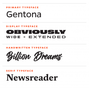
Typography is a vehicle for our brand voice, contributing to how our messages are read and communicated. Gentona is the primary workhorse for our communications. A wide display typeface called Obviously performs well as an accent to pair with Gentona or on its own in headlines.
Used together, these two typefaces create a clear hierarchy and keep our content legible and engaging. As explained below, we use Billion Dreams and Newsreader in smaller and more specialized capacities.
Note: Additional weights exist for each of these typefaces. The sections below show the approved weights within the University of Florida brand.
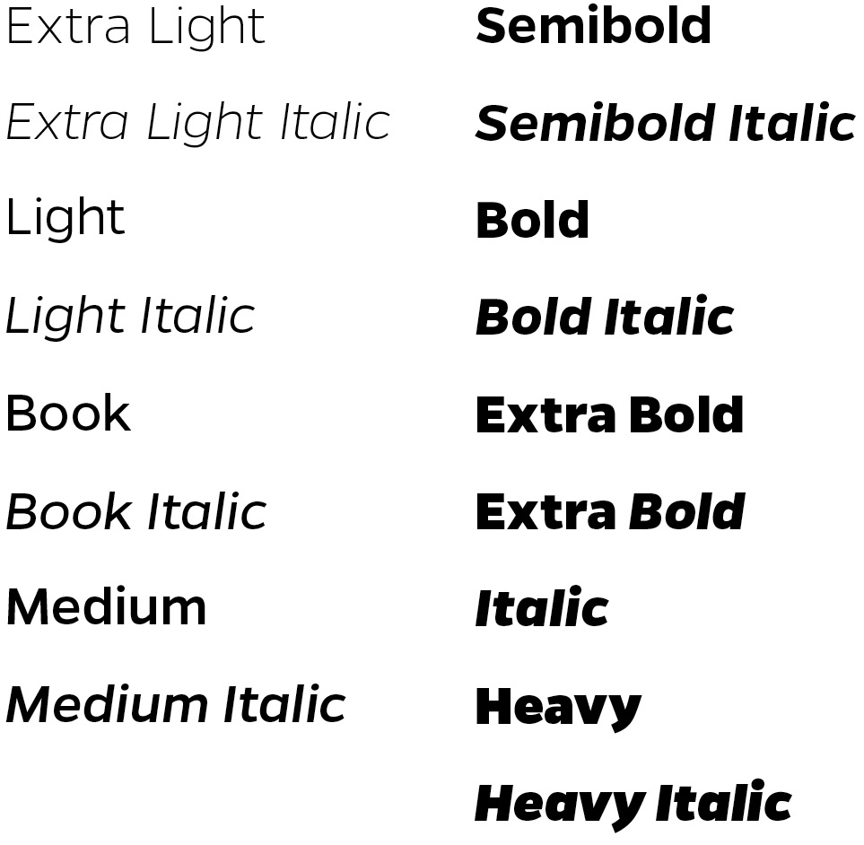
GENTONA
Gentona is a clean, friendly typeface we use frequently and in various ways. Its simple letterforms convey technical precision at lighter weights and bold impact at heavier weights so that it can be used for virtually any typographic application. Because of its simplicity, Gentona pairs well with our more expressive accent typefaces. It’s the keystone to a consistent, recognizable brand for UF.
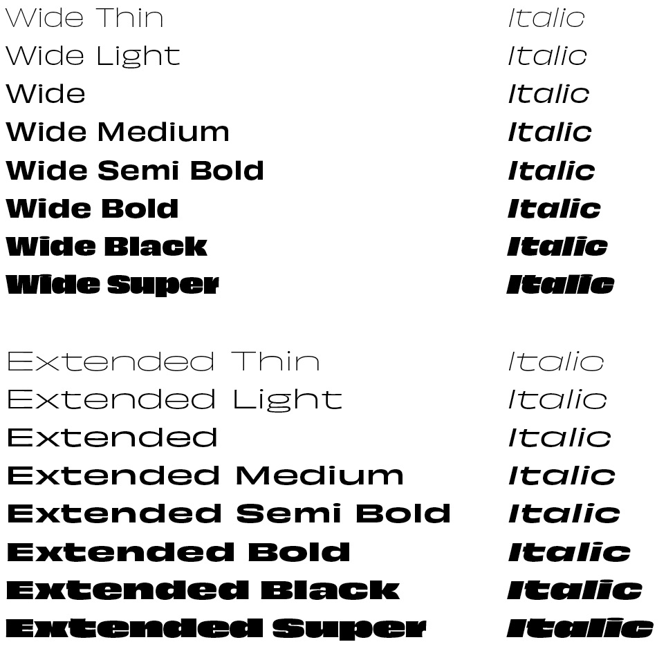
OBVIOUSLY
Obviously is a display font appropriate for brief callouts, factoids, and numbers. It is also suitable for adding particular emphasis. Its appeal comes from its rigid, vertical structure and striking character.
Note: Our approved brand typeface doesn’t include this font family’s full range of widths. Although other widths are available in the Obviously font family, our brand does not and should not use any font widths other than those listed here: Obviously Wide and Obviously Extended.
BILLION DREAMS
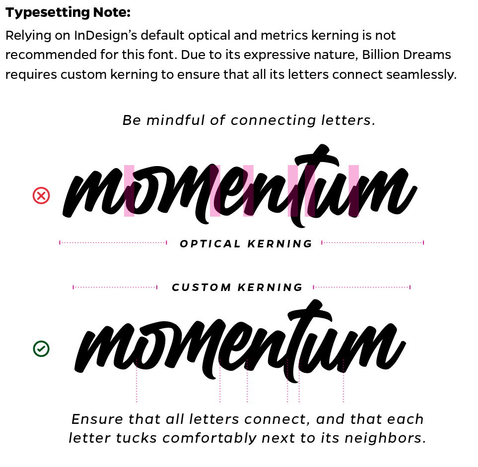
Billion Dreams is a handwritten typeface chosen to evoke ideas scribbled during brainstorming. It adds a more expressive, personal touch to our brand language. It’s best used for keywords in a headline or subhead, not for long text runs.
Note: Relying on InDesign’s default optical and metrics kerning is not recommended for this font. Due to its expressive nature, Billion Dreams requires custom kerning to ensure that all its letters connect seamlessly.
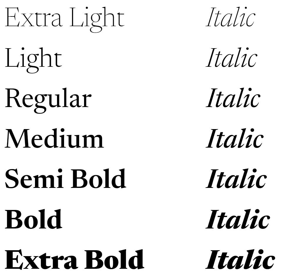
NEWSREADER
Newsreader is our only serif typeface. Its sophistication and simplicity pair perfectly with Gentona. We seldom use it for headlines; when we do, it’s for pieces with an elevated feel. Generally, Newsreader works well for long runs of text, callouts, and other supporting copy. This serif typeface feels more classically academic, while our display and handwritten options are sleeker and more modern.
DOWNLOAD BRAND FONTS
Visit the Fonts page to download our brand fonts.
ALTERNATE SYSTEM FONTS
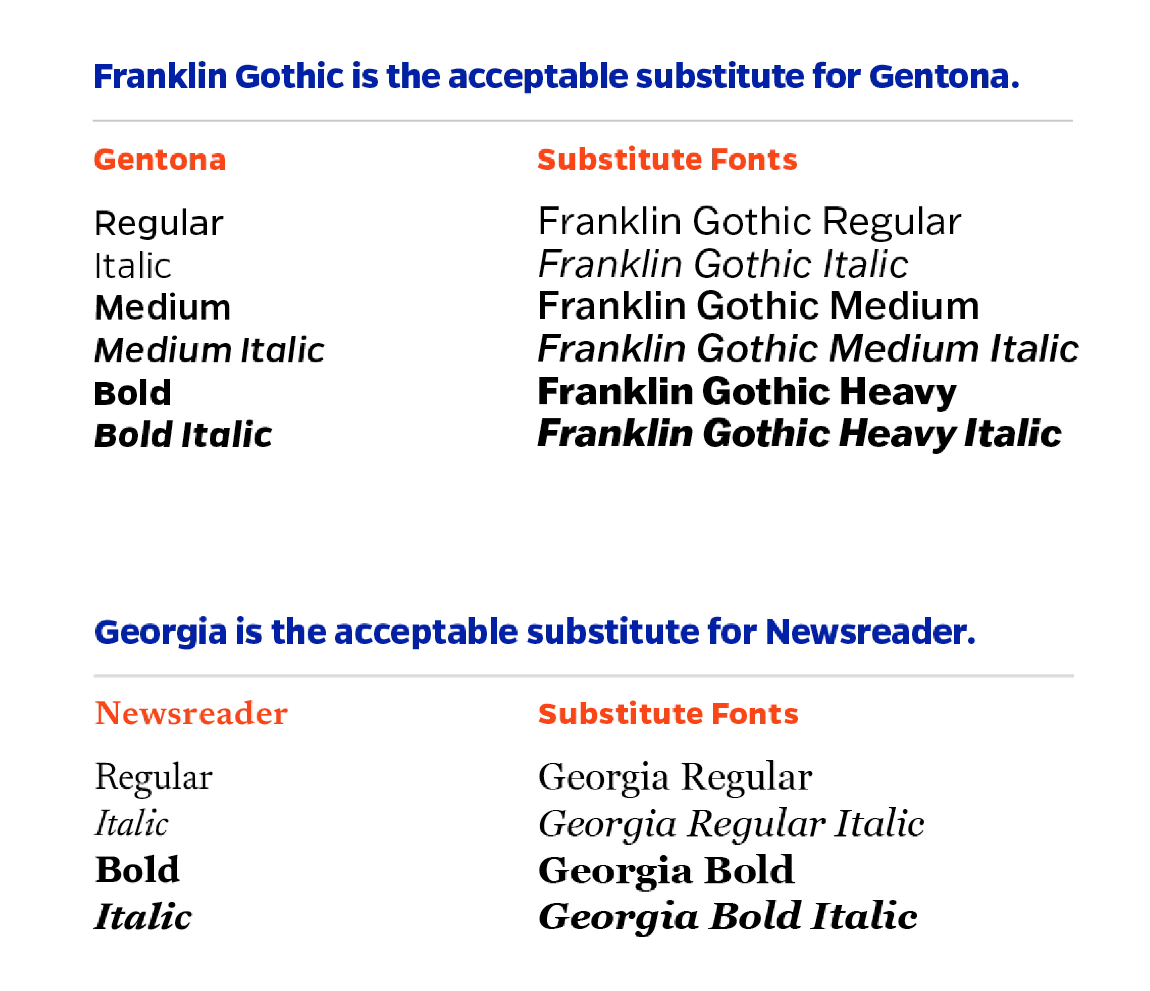
Our brand typefaces may not always be available for everyone to use in Word documents, PowerPoint presentations, and other digital applications.
In these situations, use the alternate fonts listed here, freely available on all computers.
Note: Due to the unique properties of Obviously and Billion Dreams, there are no PC substitutes for those typefaces. Restrict your usage to Franklin Gothic and Georgia as needed.
Note: If you need to represent programming code in documentation, we recommend PT Mono, which is free to download on Google Fonts.
LEADING TIPS
Using type thoughtfully is crucial to making our designs look professional. Follow these tips to make sure our typography is consistent.
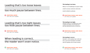
Line spacing, called leading, is critical to setting a professional-looking type that’s easy to read. Leading should be set tight, but not too tight. With our typefaces, text generally looks best with the leading set slightly looser than the default.
Tip: Start with leading that’s two points higher than the point size of the text. This won’t always be right, but leading can be easily adjusted from there. Smaller blocks of text may need settings that are slightly more open.
TRACKING TIPS
Correct letterspacing, called tracking, also makes the type easier to read. Outside of headlines, text should be tracked slightly looser than the default setting, and optical kerning should be used when it’s available (except with text set in Billion Dreams ).
When working with type, always take the time to make these adjustments. These details make us look professional and significantly improve the readability of our type.
Tip: Trust your eye. The tracking that works for one typeface may not work for another. The size and weight of the text can also influence how much tracking is necessary. Smaller sizes and heavier weights may need a higher setting.
![]()
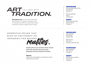
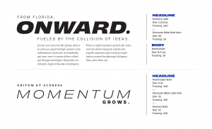
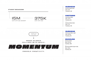
TYPESETTING EXAMPLES
The following illustrates suggested type combinations that work well together. These samples are a guide showing the range of expression that our typography can achieve.
Tip: Specifications for the headline and subhead examples on these pages may change depending on the format of the piece. The measurements shown are encouraged, but they could be scaled up accordingly.